5 Production Design Highlights From 2023
I’ve already listed my favourite films from the year but I also wanted to take the time to highlight some of the best Production Design to come out of 2023 – of the films I’ve seen so far, of course. So here are 5 of my favourites…
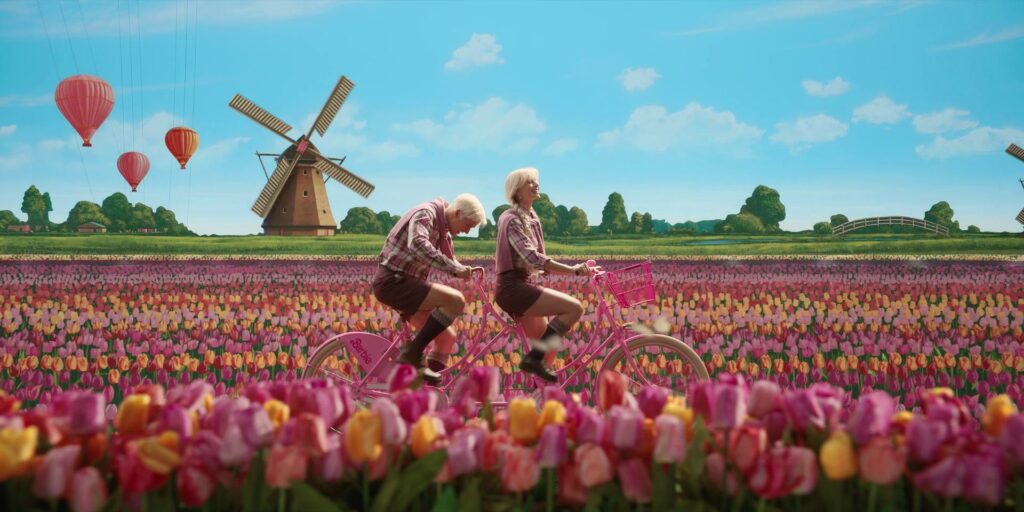
1. Barbie
Production Designer – Sarah Greenwood
The ‘Barbie Dreamland’ set for this film is insanely good. There is so much attention to detail and the referencing to actual toys is done brilliantly. I massively prefer real sets over CGI, and this film is a perfect example of how impactful this can be. It can make even the most superficial film lands feel so real and like you just want to step right into their worlds. The bright pinks and blues are so inviting and it really does achieve the carefree feel of Barbieland. It also felt very nostalgic, as if I was being transported right back to my younger self’s imagination when I was playing with my own Barbies.
I have a particular love for the mechanical transition scenes too, they’re so fun!
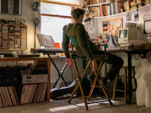
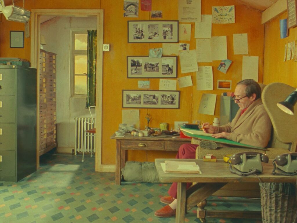
2. The Wonderful Story of Henry Sugar
Production Designer – Adam Stockhausen
I literally gasped when I saw the first set transition. The way the sets change and intertwine in this film is so theatrical, as is the way the characters interact with the sets and camera. It feels like I’m sitting at the front of a theatre audience rather than looking at my TV. The colour palettes are so beautifully vibrant and the attention to detail is impeccable. As with all of Wes Anderson’s films, every frame is a work of art.
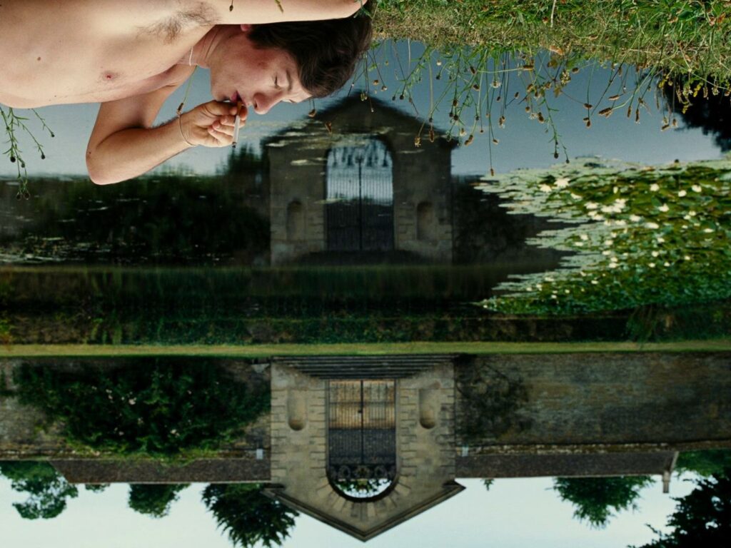
3. Saltburn
Production Designer – Suzie Davies
The design of the main house is beautiful, I love the almost gothic colour palette and the grandness of it all. The wallpaper and deep colour look as though they were picked out when the house was first built. The furniture and props all look antique, like the house, a display of enormous wealth handed down from generation to generation that the outside world can’t touch. Highlighting the exclusivity of the upper class, that to be a part of it you have always had to exist within it. (Spoiler if you haven’t seen it yet…) That is until Oliver comes along to be the exception to that rule.
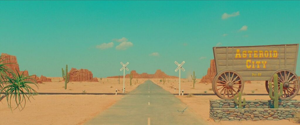
4. Asteroid City
Production Designer – Adam Stockhausen
Another Wes Anderson and Adam Stockhausen collaboration is on the list! A lot of this film looks as though it’s taken directly off a postcard, the use of a refined colour palette also makes this stand out. It goes from black and white to mostly bright blues and sandy shades, any other colours used point out the importance of those moments, for example when we see the alien. It’s very true to Wes Anderson’s quirkiness; you can’t go wrong with that.
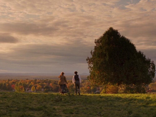
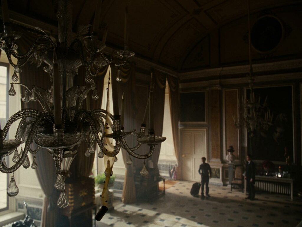
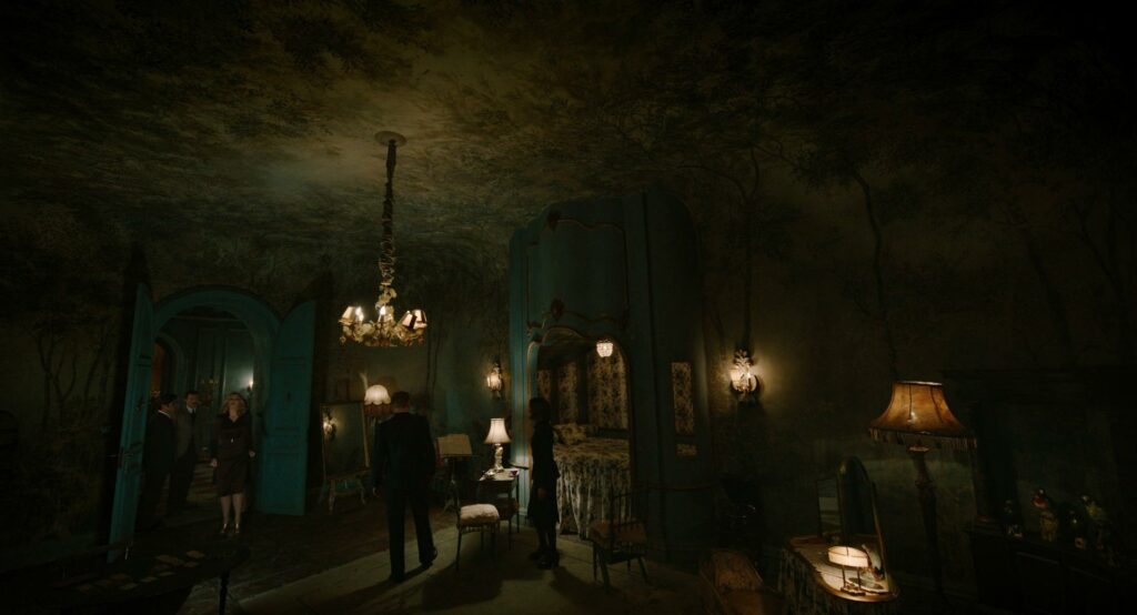
5. A Haunting in Venice
Production Designer – John Paul Kelly
Contrasted with the colourful and calm canals and alleys of Venice we have this grand and uneasy interior set. Every room gives the sense of towering over the character (with the help of the cinematography). It’s as though they hold a lot of history within their walls. The gloomy colours and texture help to achieve this. Every room looks aged and well-lived in, unmanageable even.
I adore this room in particular (see below). The curve of the wall to ceiling and the beautiful tree wallpaper hanging over the whole space feels so haunting.
I’m yet to watch ‘Poor Things’ but from what I’ve seen online, the sets are insanely good. So, I look forward to watching that and reporting back.
Are there any other films you think should be on this? ★
All images are stills from the original films, provided by FILMGRAB