Tick, Tick… Boom! | Set Picks
I wanted to start talking about set design on my blog as it’s another element of work that I do. And, having studied film back at uni, I miss talking about it so often. So, it just makes sense for me to make it part of the art world I have over here. I plan on discussing set design in Film, TV and music videos. I’m calling these posts ‘Set Picks’ but there may be variations on this content later down the line.
I’m starting with ‘Tick, Tick… Boom!’ as I watched this recently for the second time since it was first released to Netflix in 2021. Directed by Lin Manuel Miranda and Production Design by Alex DiGerlando.
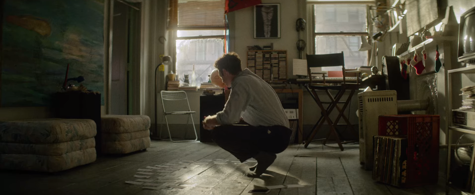
I particularly want to focus on the NYC apartment set design. The apartment design embodies three main elements. One, that it is set in the early 90s. Two, that a creative lives there. And three, is that it is located in New York City. Here’s a quick rundown of why I think it’s achieved these things so well:
The Early 90s
The most obvious clue to the time period this film is set is the technology within the set. There are shelves full of cassette tapes and stacks of vinyl – while these have seen somewhat of a comeback, it feels authentic that these were the main source of listening for the protagonist. Another is the huge computer and chunky keyboard combo that just wouldn’t be seen in the modern day.
A Creatives Home
This apartment is full of creative clutter. As a creative myself, it is quite familiar. Stacks of books everywhere, creative tools (in this case instruments), notes and art all around. There is so much personality in every corner of the apartment. The kind of controlled chaos that is comparable to an artist’s mind.
NYC
The cramped space and rugged looks are definitely giving New York City for a struggling artist. The mismatched furniture really helps sell this point, they’re likely left behind by the landlord, bought secondhand, or donated by friends and family. A familiar renters struggle. Bear in mind, this is coming from someone that has never been to NY so this idea is entirely based on what I’ve seen in other films and TV (and of course the common knowledge that living in a big city is crazy expensive).
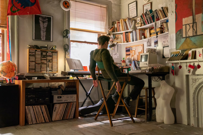
I’ve also read that it was closely reference to images of Jonathan’s real-life apartment, even including some of his actual possessions. I think this attention to detail has really paid off in the level of authenticity the set design gives off. This set design does such an excellent job of letting the audience get to know the protagonist, Jonathan.
Here are some other articles I enjoyed reading about the ‘Tick, Tick… Boom!’ sets:
- The Apartment: Tick, Tick… Boom! – Netflix Queue
- …More Tick, Tick, Boom – Set Decor
Available to watch on Netflix.
Do you have any favourite NYC apartment sets? ★